The Redcarpet Card Design: An Ode To Our Roots and Customers
19th Dec 19
After several changes to our app and striving to improve our services every day, we decided to make one more major change to our company’s fabric. We decided to redesign our cards.
When we started redesigning the Redcarpet cards, we only had one idea, to begin with. We wanted to create a card that reflected our global perspective and our drive to modernize our credit & lending infrastructure as well as showcase our Indian roots. In simple terms, we wanted our card to be representative of our motto:
Modernise without Westernise
We partnered with a graphic design studio called Life and Half, who interestingly, espoused the same philosophy as we did. Together, we got to work.
The Challenges We Faced
We knew we wanted to create a card that appealed to our audience and had a unique identity in the global context as well. This, in itself, became our first challenge. Our user base is so diverse that we knew we couldn’t cater to one particular target audience. So, we had to figure out a design language that catered to our needs and represented our motto as well.
Our research plans were extensive. So, we decided to learn from the industry standards to ensure the best service. Moreover, we decided to conduct internal research and discussions to ensure that we were reflecting the motto of our company in our cards. In short, we needed our cards to do the talking for us.
We were impressed with Monzo’s hot coral card design that ended up doing a lot of word of mouth marketing for them. The industry standard is to create minimalistic cards dominantly using matte black/ blue colour. Visa and Mastercard operate on similar lines. However, Monzo decided to take a leap and create a card that they described as ‘pretty.’ They decided to use neon colours that reflect light, making them appear shiny and bright.
<img src="/images/blogs/image4.jpg" width="15%" height="10%" style = "border:none">However, a great design was only half the battle won. We needed our card to represent the company. A major part of our research was interviewing a lot of our customers. This ranged from students who used Redcarpet to sponsor their education to salaried people who used it to fund their business or buy a new car. Our userbase was large and inherently diverse. The challenge was accommodating it in our cards.
Moreover, we wanted to understand the universe of things that our interviewees interact with. We wanted to know about the brands/ apps/ services that they might consider friendly or had any sort of affinity with.
We also showed them a bunch of existing and mock-up cards to figure out the designs they liked the most. This exercise wasn’t aimed at finding the design direction. In fact, it was aimed at understanding the design that they appreciated and the structures that they associated with. Above all, we wanted to be clear about what motivates our client base before we materialized that into our design. As we later realized, all of our design iterations were closely influenced by the insights we gained from these interviews.
Our Insights
We quickly realized that all of our interviewees had one thing in common, a very strong sense of motivation to achieve their goals. Their sense of determination came out very strongly in all the interviews. For them, Redcarpet services was a way to be one step closer to their goals. Now, we had to find out a way to convert this into a graphical language. While looking for design ideas that represent our company’s motto and userbase, we researched for the best designs out there. N26, a German direct bank wanted their card to represent the transparent way they hold their banking operations. Their card represented what their company stood for with a near translucent design.
<img src="/images/blogs/image10.jpg" width="15%" height="10%" style = "border:none">Furthermore, we realized that our interviewees related to traditional design codes the most. Out of all the mock cards, they chose the cards that seem to strike the perfect balance between sound cultural Indian codes and minimalistic designs.
Most importantly, we noticed that our clients did not recognize us as a ‘brand name’. They viewed us as a service that was integral to their goals. Now, this gave us the freedom to design a message that we wanted to put out, rather than what was expected of us.
And with this, we got to work. Again.
Idea 1: Ascending Endlessly- Inspired By Our Logo
Inspired by the staircase motif in the logo, our first iteration included gradients and negative space. The cards liked by most of our interviewees had a very visible and strong contrast. We tried to accomodate in our cards along with different abstractions of a staircase that gave an illusion of going upwards. This was a metaphor for ambition and endless possibility. Needless to say, this was inspired by the deep determination we found in a lot of our client interviewees.
<img src="/images/blogs/image11.png" width="15%" height="10%" style = "border:none">The different variations of this idea were an illusion of seeing a staircase from different angles. Another one of our variations was a further abstraction of the same concept using colour blocks. This version was a far more abstract concept that left a lot of interpretation.
<img src="/images/blogs/image2222.png" width="15%" height="10%" style = "border:none">Idea 2: Adding Guilloché Pattern
Our second card design idea included a decorative technique called Guilloché or guilloche. It is an extremely precise and intricate motif design which is generally used for intersecting or overlapping spirals or repetitive shapes. Apart from being used in architecture designs since the 1500s, it was used by banks to prevent forgery. It was used for creating designs of printed currency/certificates including subtle thin lines called the Spirograph.
At Redcarpet, we are very particular about security. But it all pays off in the end as our customer interests and security are protected. Whenever a customer enters sensitive information such as credit card/Debit Card details or any banking details on our Application, we encrypt that information using secure socket layer technology. What’s more, unlike the industry norm, we are absolutely open about the information we choose to collect from our users.
We knew that the Guilloche pattern will allow us to represent this aspect of our company. Our first iterations look something like this:
<img src="/images/blogs/image1.png" width="15%" height="10%" style = "border:none">The alternatives we created for this idea closely resembled a thumbprint, which is a representative of identity and security. This was also an ode to the way we conduct our business. A lot of times, we differ from industry norms because we are dedicated to providing all of the required information to our clients.
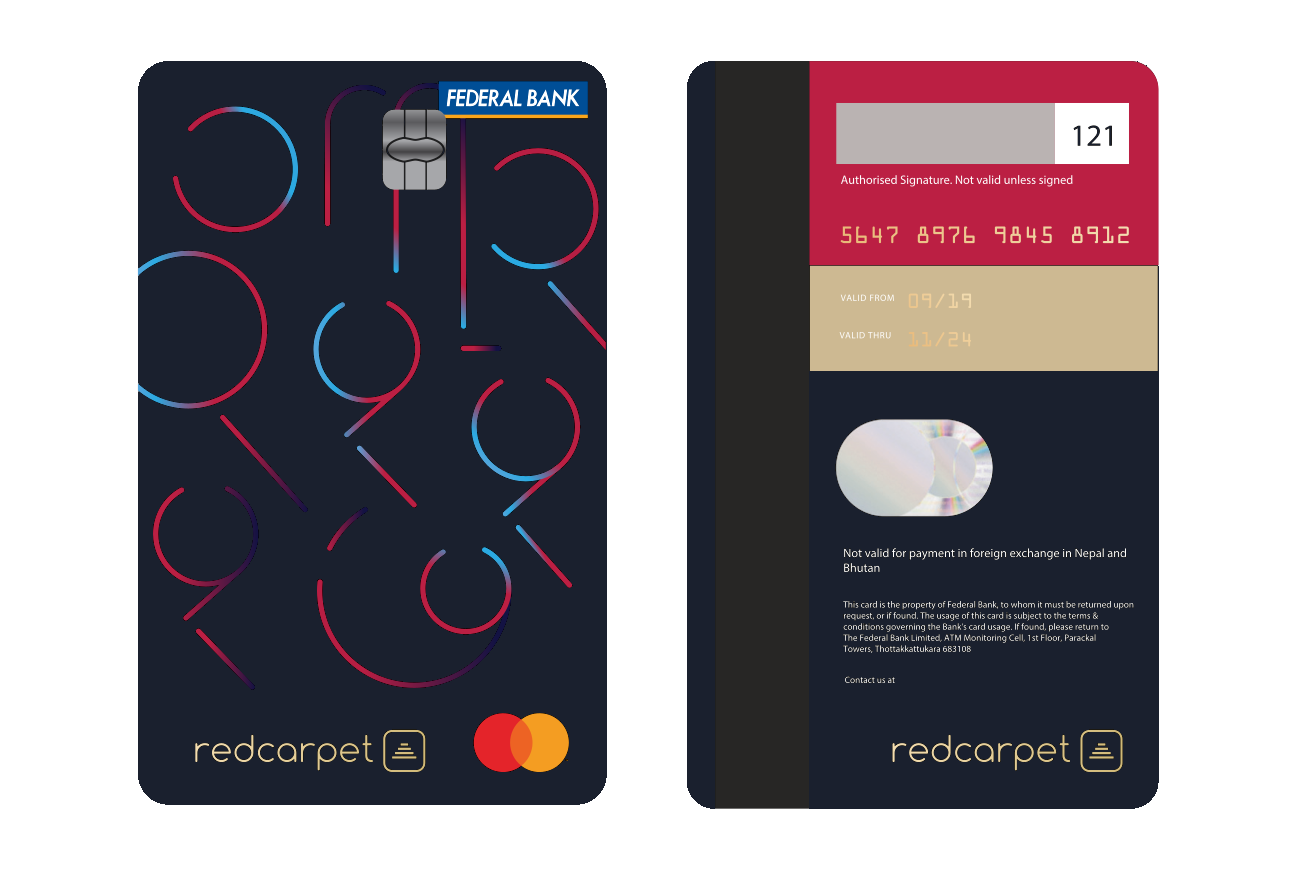
<img src="/images/blogs/image5.png" width="15%" height="10%" style = "border:none">Idea 3: Numbers In Indian Languages- A New Indian Cool
Our final card design drew attention to our roots by including Devnagri script numbers. We created a geometric version with a design that wasn’t necessarily recognised as numbers but immediately reminded us of culturally familiar shapes. Moreover, it was an obvious ode to our work that deals with a lot of financial data. In other words, it represented a new Indian cool!
But then again, we couldn’t just include Devnagri number designs without thinking of our diverse user base. We wanted a card that people automatically associated with their own culture. So, we ended up choosing a number from every major Indian language. This covered one part of our message. But we had to incorporate a graphic language that signified our dedication to modernization.
We ended up creating an iteration that modified the number motifs in a way that they seem like tech symbols.
<img src="/images/blogs/image8.png" width="15%" height="10%" style = "border:none">Now that the design was finalized, we had to choose a particular set of numbers that would feature on the card. Otherwise, we would have endless possibilities that could only result in confusion among our clients. And then, an idea from one of our founding members was the final touch we needed:
We decided the include the numbers of the RedCarpet founding date- 2013-12-17. Our final result was exactly as we expected it to be:
<img src="/images/blogs/image6.png" width="15%" height="10%" style = "border:none">Informing Our Customer: The Letter
Now that we had chosen the perfect card design, we needed to let our customers know about the same. This was a big challenge on its own because we wanted our customers to be as excited about the cards as we are. We decided to partner with Lakshay Kumar, a designer who understood our vision perfectly.
We wanted our letter to be a ‘quick peek’ into our thought pattern that led to the final card design. On the flip side of the letter, we included some inherently Indian motifs like a kite, a gullack, a kulfi, and autos. This was, again, an ode to our roots and visual cues that took inspiration from the ‘Indian’ fabric. This was to invoke a sense of belongingness as our customers could immediately relate to these motifs. We took a very minimal approach to colours and artwork and played with only lines and dots. We aimed to work with colours like red and grey undertones that highlighted the importance of red as a brand colour.
<img src="/images/blogs/image3333.png" width="15%" height="10%" style = "border:none">The inner artwork included a very particular design structure. It depicted two hands protruding from the same arm. The arm design gave the impression of ambiguity as the reader couldn’t tell the two apart. This was to signify the vision of ‘One India’ indicating to the idea of unified India through proficient financial services.
The left hand appeared to be in the ABHAYA MUDRA which is a sign of protection and reassurance. This is one of the earliest mudras that are often found in Hindu, Buddhist and Sikh cultures. The use of this mudra signified our commitment to financial security and customer transparency. Moreover, in many cultures, this mudra signifies the dispelling of fear. We wanted this to stand for our innovative ways that might not follow the norm but aim to provide the best customer services in the end.
<img src="/images/blogs/image9.jpg" width="15%" height="10%" style = "border:none">The right hand gestured to create the MAYUR MUDRA which is an expression of joy and symbolizes the act of heading towards a new direction. This signified our dedication to always improving ourselves and finding joy in providing financial ease to countless Indian users.
<img src="/images/blogs/image7.jpg" width="15%" height="10%" style = "border:none">Conclusion
Our final card and letter versions evolved into something far different than how we first envisioned them. However, the message that they carried remained the same. Most importantly, we were able to represent our company and country’s fabric through these final designs.
About The Author: This post has been written by Sandeep Srinivasa and Etee Dubey.