The New Redcarpet Onboarding Form
9th Jan 20
In one of our previous posts, we detailed why we decided to re-design our onboarding flow. We conducted thorough research to understand what our users actually wanted. We optimised our form by revamping our welcome screen and introducing a hassle-free personal details section. Moreover, we took steps to ensure that our form could be filled as quickly as possible. This resulted in a form that ensured maximum user comprehension and lowest drop-off rates.
However, we still had a long way to go. We knew that our form could improve more in terms of the user interface. Moreover, we wanted to optimise our onboarding time even further. This entailed a long list of changes and edits. This blog details why and how we started using a more intuitive and faster onboarding flow and how it helped our users.
1) Increased User Comprehension
A recent article by Trychameleon stated the importance of user comprehension during the onboarding flow in the best way possible:
“As users move through the customer lifecycle, they progress when they understand how the product fits into their lives. And if they don't understand, they churn. User onboarding can be the difference between users staying and leaving.”
Even though Trychamaleon talks about product-related user comprehension, this analogy fits right for the onboarding form as well. We wanted our form to be extremely easy to understand to ensure the lowest amount of drop off rates. Our onboarding form needed to strike the right balance between being easy to understand and providing the apt amount of information.
We took several steps to ensure this. For starters, we made changes to ensure that our users were aware of their stage in the process of form-filling. Furthermore, we made sure that our users knew the next step of the process. The new user interface (UI) depicted vertical cards that informed the user of their stage in the form-filling process. These stages could be classified in the following sections:
- 1) Personal Details
- 2) Segment Selection
- 3) Segment Details
- 4) Address Details
- 5) Government Id Verification
- 6) Verification of Pan Card
- 7) Documents Upload
- 8) E-sign
We took inspiration from apps like Duolingo that ensured the user comprehension by including a progress indicator. The progress bar helped to set the user expectation to complete the form. The user remains committed to filling the form as they could track their progress in real-time. Most importantly, this technique utilises the goal gradient effect. This ensures that the user works hard to complete the goal (filling the form) as they get closer to completion.
<img src="/images/blogs/image2.png" width="10%" height="5%" style = "border:none"> <br/> <img src="/images/blogs/image3.png" width="10%" height="5%" style = "border:none">Furthermore, we started locking the successive stages of the form-filling process. For instance, a user could only move on to the ‘address details’ section once they had completely filled the ‘personal details’ section.
2) Major Changes To App Display
We also made some drastic changes to our onboarding form’s colour pattern to keep it in line with our company’s colour scheme. Moreover, we kept our introductory slides short and precise. We restricted the number of slides to two and informed our users how they could use our app to aid themselves. This was done with the aim to deliver the most amount of information in the easiest way possible.
<img src="/images/blogs/image4.png" width="10%" height="5%" style = "border:none"> <br/> <img src="/images/blogs/image5.png" width="10%" height="5%" style = "border:none">Here, we were inspired by apps like Airbnb that have amazing introductory slides. The combination of visual appeal and clutter-free information is a great way to decrease customer churn rates.
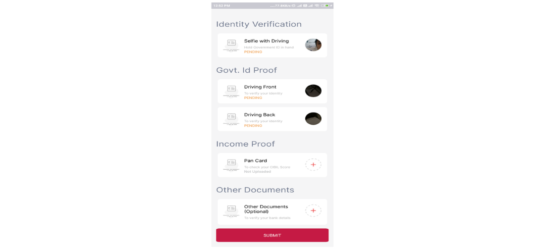
<img src="/images/blogs/image6.png" width="10%" height="5%" style = "border:none"> <br/>3) Instant Notification Regarding Status
During our research for the new onboarding form, we found that our users were left confused if their application was rejected. They were not satisfied with the information that was provided to them regarding their application rejection.
Hence, we rectified this problem by instantly displaying the approval status of any document that they uploaded. In our previous app, a card used to display if the user document was "pending", "approved" or "rejected". However, the new form displayed the reason for their rejection and an option to reupload the documents.
Conclusion
In our new onboarding flow, we took major steps towards increased user comprehension and decreasing the onboarding time. However, even after introducing such major changes, we felt that we could do better. We will be detailing how we ended up updating our onboarding form yet again in one of our upcoming blogs.
About The Author
This post was authored by Balram Pandey and drafted by Etee Dubey.